


Summary
Summary
HOW TO ADULT
The genesis for the personal financial app idea came when I was just turning 30 and the Great Recession was just starting to fade. I just got a significant pay raise and was very much interested in trying to be an “adult”, but I found I was still living paycheck-to-paycheck. There were plenty of bank and finance apps out there to help view my balances, but none really visualized my financial situation or helped me understand the steps needed to get to financial maturity.
That is until I came across a very useful flowchart describing tactical steps a person would need to take to go from paying your bills, to setting up an emergency fund all the way to retiring early. It was easy to understand, flexible to my personal goals and the steps were achievable. It was a bit ugly, but it was a good start.
At the same time, I was working at a tech company and was introduced to a burndown chart to track development progress. A burndown chart is used to compare the work left to do vs time left. It was an interesting parallel to my problem of spending all of my income each pay period. I thought a constant reminder of when I would “run out of money” might be a good way to curb my spending and leave room for saving.
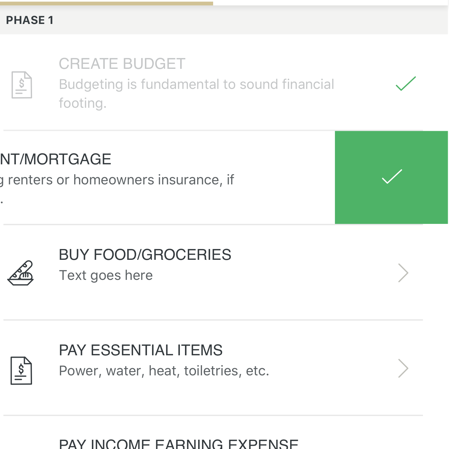
Flow Chart
Flow Chart
WORDS FIRST
After doing some half-assed internet research I moved right into roughly outlining (using words only), the user needs and major features. I do this primarily to get down any ideas and insights that I had during the research phase. Even though I was the “user”, I still wanted to imagine how someone else might use this app. What mental models would they draw upon while using this app? What narrative would this app tell? This sets me up for the next stage, visualizing the app.
Listing out all the functions of the app hierarchically has a bonus effect of making the app much easier to communicate to developers later on.


Copy of Sketches
Copy of Sketches
PAPER & PENCIL
I like to use paper and pencil early on to quickly visualize the insights and ideas from the outline. I’ll sketch out multiple pages of ideas to make sure I get passed the cliché ideas and push any assumptions I may have going into it. Because much of the information is irrelevant until you’ve reached a later stage, I knew I wanted to emphasize a “journey” but make it more flexible than a rigid wizard. I kept visualizing a 3D journey across an ever changing (and improving) landscape as a way to bring the user through this journey. I eventually dropped the 3D idea in favor of a more simplified linear design that was much more practical and easier to develop.

Copy of Wireframes
Copy of Wireframes
FRAMING IT OUT
* After quickly sketching out ideas I like to go onto the computer and flesh some of these ideas out into foundational wireframes.
* The goal of creating wireframes is to visualize the flow, layout features and establish hierarchy. Details like color, fonts, iconography can come later.
* I setup a rough prototype to feel what it would be like to navigate through this app.

Copy of UI Design
Copy of UI Design
DRAWING PICTURES
* Once wireframes and prototype are finalized, I like to start adding details like font choices, color pallets and other UI details.
* In this case, branding had to be created at the same time. But I’m not going to focus on fully branding at this moment.


Copy of Conclusion
Copy of Conclusion
CONCLUSION
Should have been more adventurous with my design choices.
It was prudent to be more conservative, but it’s missing a level of personality and excitement that would be more appealing to the age demographic it was designed to help.


